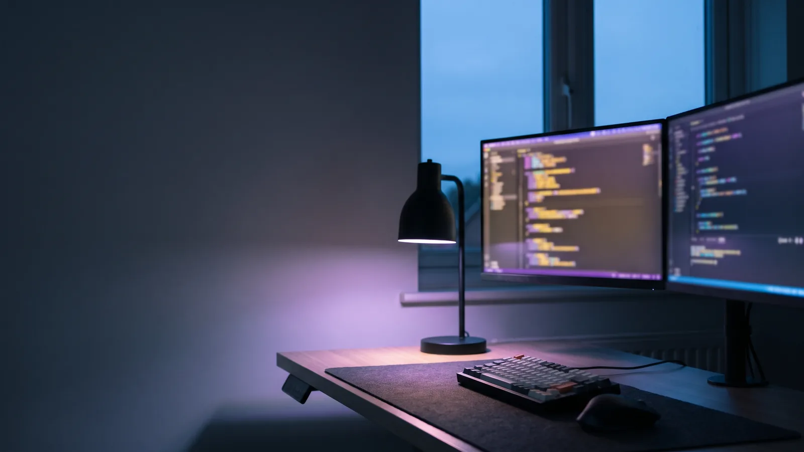
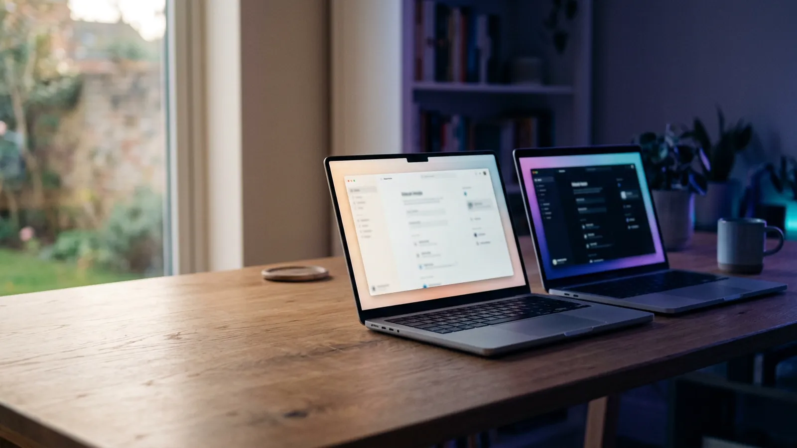
- For reading, light mode wins for most people with normal vision: studies found better proofreading and sharper reading with dark text on a light background.
- Dark designs still have a place. They feel premium, suit visual and night-time products, and many people prefer them. Often the best answer is to offer both.
- Colour shapes first impressions. Research links blue with competence, which is one reason iVishwa's own site moved from black to a deep navy.
An earlier version of this article claimed that dark, neon-accented designs increase how long people stay. When I went looking for good evidence for that, I could not find it, so I have rewritten the article around what the research does show.
Dark or light for reading?
For people with normal vision, dark text on a light background is easier to read. Researchers found that this "positive polarity" improves reading performance, and linked the advantage to higher screen brightness, which makes the pupil smaller and the image sharper (Buchner, Mayr and Brandt, 2009). A 2013 study by Piepenbrock and colleagues found the advantage for both younger adults and adults aged 60 to 85, in proofreading and in reading small text.
That does not make dark mode wrong. It means that for long reading, such as articles, documentation and contracts, a light option should exist.
When a dark design is the right choice
- Visual work: photography, film, 3D and design portfolios, where images glow against a dark frame.
- Premium and night-time brands: hospitality, entertainment, luxury.
- Apps used at night or for long sessions, where a bright screen is unpleasant.
- Preference: many people simply like dark mode, and phones let them ask for it.
The best answer for many businesses is both: a design that follows the visitor's device setting and offers a switch. In our Design Studio, "Both, with a switch" is one of the options, and the preview lets you try it.
Whatever you choose, contrast decides
WCAG asks for a contrast ratio of at least 4.5:1 for normal text. Dark designs often fail with grey text on near-black backgrounds, and light designs fail with pale grey text on white. Check every text colour, in both modes.
Colour and trust
Colour carries meaning before anyone reads a word. In a well-known study in the Journal of the Academy of Marketing Science, Labrecque and Milne found that colours shift how people judge a brand's personality: blue was linked with competence, red with excitement, and purple with sophistication.
Trust matters even more when people hire a service they cannot try first. In GoDaddy's 2022 research with US small-business owners who had hired a web professional, trust was one of the three qualities that decided who they hired, and 64% said they would feel suspicious of a professional with no reviews.
That is why iVishwa's own site changed this year. It used to sit on near-black. It now uses a deep navy as its base: still dark, still showing off the 3D work, but closer to the blue that people associate with competence, with violet and cyan reserved for highlights.
A word on motion
Animation should explain something: where a menu came from, what changed, where to look next. Movement purely for decoration gets tiring, and some people feel ill from it. Every animated site should respect the device setting that asks for reduced motion. All of mine do.
How to choose for your brand
- Who are your visitors, and when do they use your site? Daytime research or evening browsing?
- What will they mostly do: read, look at images, or buy?
- What should your brand feel like: calm, premium, energetic, trustworthy?
- Check contrast in every mode you offer, and test on real phones outdoors.
Sources
- Buchner, Mayr & Brandt (2009): The advantage of positive text-background polarity is due to high display luminance, Ergonomics
- Nielsen Norman Group: Dark Mode vs. Light Mode: Which Is Better? (summarising Piepenbrock et al., 2013)
- Labrecque & Milne: Exciting red and competent blue: the importance of color in marketing, Journal of the Academy of Marketing Science
- W3C: Understanding WCAG 2.2, Contrast (Minimum)
- GoDaddy: What clients want from web designers and developers (2022)

I design and build websites, online stores and business systems for clients in the US, UK, Europe, Australia and Canada, from Colombo, Sri Lanka. When you work with iVishwa, you talk to me directly, from the first call to launch and after.
Want a straight answer for your own project?
Design your website in the Studio, tell me your budget if you like, and I will reply with one fixed, written quote.