- A home page works when it answers a visitor’s questions in the order they ask them: what is this, what can I buy, how do I use it, does it work, and who is behind it.
- Start with fewer sections and real pictures. A strong hero, one product section, reviews and a signup already make a complete page.
- Keep the first screen light: the hero decides how fast the whole page feels.
Most beauty home pages are built the way a mood board is: the prettiest pictures first, a product grid somewhere, a newsletter at the bottom. Shoppers do not read a mood board. They arrive with questions, and they leave when the page does not answer them in the order they ask.
This guide is the plan we use for skincare and makeup brands on Shopify. It works with any theme; where it mentions a specific section, the name is from our Acanthus theme, whose help guide has the click-by-click steps.
The five questions, in order
| Part | The shopper asks | What answers it |
|---|---|---|
| 1. The promise | What is this, and is it for me? | A hero with one clear sentence and one button |
| 2. Shop | What can I buy? | A short product shelf, and a quiz for the unsure |
| 3. The ritual | How do I use it? | Routine steps, a set or a bundle |
| 4. The proof | Does it work, and can I trust it? | Ingredients, results with their method, reviews |
| 5. The house | Who is behind it? | Your story, questions, the journal, a signup |
1. The promise: one sentence, one button
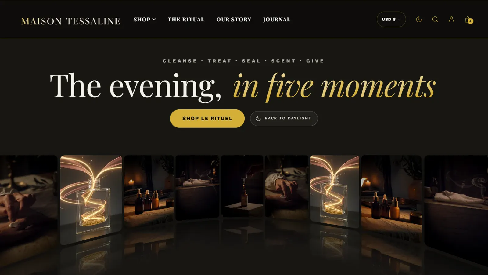
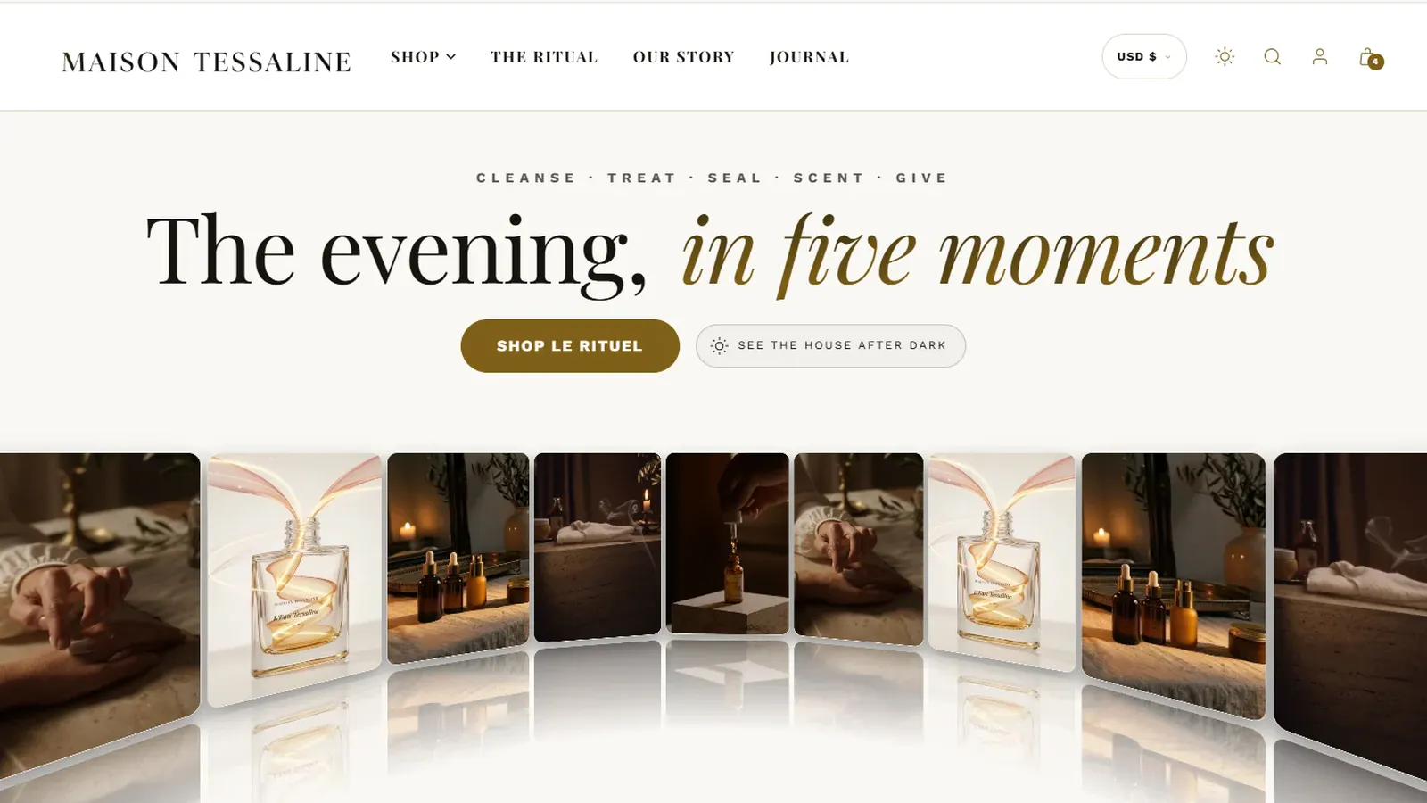
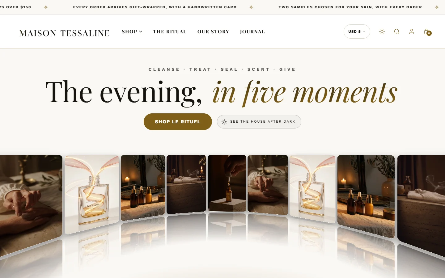
The first screen has one job: tell the right visitor they are in the right place. Write what the customer gets, not what the brand is. "The evening, in five moments" says more than "Welcome to our store". Keep it under eight words, because phones break longer headings into three lines.
Give the hero one main button, to the place most visitors should go next. A second, quieter link is fine. Three buttons is a menu, and menus belong in the header.
2. Shop: a shelf, not a catalog
The home page is not your catalog. Show six to twelve products from one collection built around a need ("The evening ritual", "For dry skin"), with your best seller first. Most visitors only look at the first three or four.
For shoppers who do not know where to start, a one-question quiz ("What does your skin ask for tonight?") turns hesitation into a product. It does not need an app: a product finder section with three to six answers is enough.
3. The ritual: how it fits into a day
Skincare is bought as a routine and used as a routine. Show the steps, cleanse, treat, protect, and which product fills each one. Shoppers who see where a product fits buy it with less doubt, and shoppers who see the whole routine often buy more than one step. Our guide to selling the routine goes deeper.
4. The proof: show your working
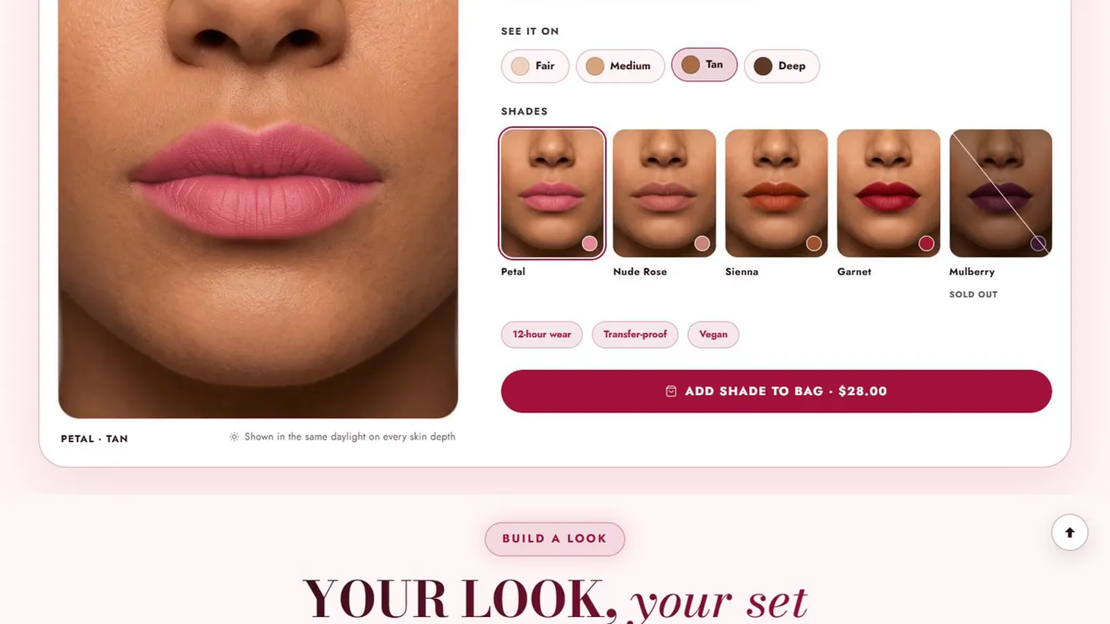
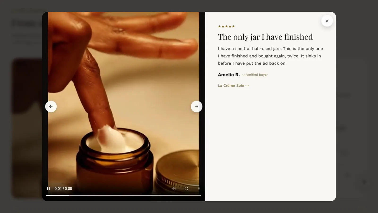
Beauty shoppers have learned to distrust adjectives. What persuades them is evidence they can check: the dose of each active, how a result was measured, a review with a photo in daylight. A section that crosses out what your formulas leave out, one item at a time, does more than a paragraph of promises.
Only publish figures you can back up. Our article on honest urgency and claims explains the rules.
5. The house: who is behind it
End with the people: your story in a few lines, answers to the questions you are asked every week (shipping, returns, sensitive skin), and a signup that offers something real. This is where a visitor who is not ready to buy today decides to come back.
Five mistakes that cost sales
- Too many sections. Each one adds pictures to load. Ten to eighteen is plenty.
- Several films playing at once. One per screen keeps phones smooth.
- Text on busy pictures. If you have to squint, so do your customers. Use an overlay or a calmer part of the photo.
- Demo pictures left in place. Shoppers notice stock photography, and it says the shop is not finished.
- A heavy first picture. The hero decides how fast the page feels. Google counts a page as fast to load when its largest element appears within 2.5 seconds for most visits.
Start small, then add
A hero, one product shelf, reviews and a newsletter make a complete home page on day one. Add the ritual, the proof and the story as you have the pictures and the words. A page that is honest and quick beats one that is full and slow.
Sources

I design and build websites, online stores and business systems for clients in the US, UK, Europe, Australia and Canada, from Colombo, Sri Lanka. When you work with iVishwa, you talk to me directly, from the first call to launch and after.
Building a beauty store on Shopify?
Acanthus is our Shopify theme for skincare and makeup brands: every tool in this series is built in, with a help center that walks you through each one.