
Select Product grid on a collection page in the theme editor.
Filters
Filters come from Shopify's free Search & Discovery app: add filters for size, color, price and product type there. In the Product grid, choose the Filter layout on large screens: a sidebar, a row of dropdowns, or a drawer.
Quick refine and My size
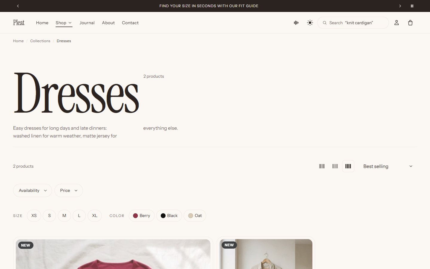
Turn on Quick refine by size and color. Shoppers tap a size or a color above the grid and see only what is left in it. With Show a My size shortcut, a shopper who has told the store their size filters to it in one tap.
The grid
| Setting | What it does |
|---|---|
| Columns on large screens, Columns on small screens | Products per row |
| Let shoppers choose products per row | Buttons above the grid; card images adapt so they stay sharp |
| Pagination | Page numbers, a Load more button, or infinite scroll (it loads up to three pages on its own, then shows Load more so the footer stays reachable) |
| Category shortcuts | Links to sub-collections above the grid |
| Editorial tile | A block that places a photo and a message inside the grid |
Templates
Besides the default, Selvedge has gallery (cards of mixed sizes), index (a typographic list with previews) and editorial templates. Choose one per collection in the admin under Theme template.
Was this guide helpful?
Still need help?Write to us with your shop's address and a screenshot. We reply within two business days, Monday to Friday, usually sooner.
Contact support