
Fashion is sold on feeling as much as on facts. Selvedge's editorial sections give your shop the rhythm of a magazine: words that light up as you read, photos that zoom into the cloth, looks that glide past. They all follow the same three rules:
- They move with the scroll, not on a timer. The shopper is always in control: scroll back, and the story rewinds.
- They run on the graphics card, pause when off screen, switch to lighter versions on slow phones (lite mode), and stand still for shoppers who prefer reduced motion.
- They stay readable before, during and after the motion. Words that light up start at a faintness that still meets contrast guidelines in your color scheme.
Here is each section, what it is for, and how to get the best from it.
Scroll-lit statement
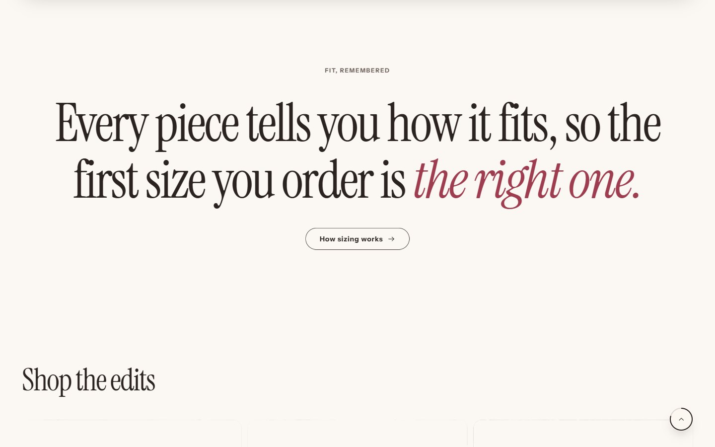
A large sentence whose words light up one by one as the page scrolls, with an optional caption and button underneath.
Use it for your brand promise or a fit promise: "Pick your size once and the store remembers it."
- Keep it to one or two sentences, 12 to 25 words.
- Wrap the words that matter in asterisks: they are set in the accent color and accent font.
- Text size and Alignment set the scale; large and left-aligned reads as a manifesto, centered as a quote.
- Point the button at the page that proves the promise: the size guide, your story, the returns policy.
Mixed typography
A headline that mixes words with small photos and videos set inside the line, in pill, circle or arch shapes. Turn on Reveal word by word while scrolling for the words to rise in as the line enters the screen.
Use it for a season or collection introduction: "Linen [photo] for long [video] summers."
- Add Text, Image and Video blocks in reading order, and a Line break block where a new line should start.
- Use close crops in the images: a texture, a hand, a detail. They are small.
- The Accent font in Theme settings > Typography sets the highlighted words.
Stacked stories
Story cards that stack on top of each other as the page scrolls, each with an image, a heading and text: chapter after chapter.
Use it for your story in three or four chapters: the cloth, the fit, the making, the wear.
- Give every card an image of the same shape.
- One idea per card, two sentences each.
Fabric close-up
A photo or video that zooms into the cloth as the page scrolls, with detail callouts.
Use it for what makes your fabric special: a selvedge edge, a weave, a stitch, a finish.
- Use a high-resolution photo (3000 px wide or more), sharp where you zoom.
- Set Zoom point from the left and Zoom point from the top on the detail, and the Zoom strength.
- Add Detail blocks to name what the shopper is looking at.
Runway gallery
A row of images and product cards that glides sideways as the page scrolls, with depth on the images.
Use it for a new collection: campaign images between the products they show.
- Mix three or four campaign images with product cards; Card size and Image shape set the rhythm.
- A heading and button at the start frame it: "The autumn edit — Shop the collection".
Orbit carousel
Product cards on a turning ring, with an optional floor reflection. It turns on its own or by drag, swipe and the arrow keys, and pauses when the shopper interacts.
Use it for a capsule or best-sellers: six to ten products from one collection, with photos on the same background.
Clothes rail
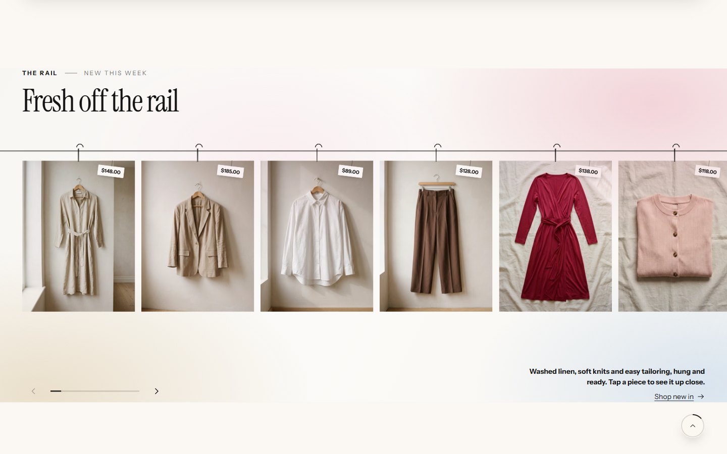
Products hanging on a rail that shoppers slide along, with price tags. On phones the pieces swing when the phone is tilted or shaken, and each piece opens in a full view.
Use it for new arrivals with hanger or flat photography. Turn on Blend white image backgrounds into the color field when your photos have white backgrounds, so the pieces look cut out.
Collection index
Your collections as a typographic list: large names, with a preview image that follows the pointer, and an optional product count.
Use it for navigation that feels editorial: four to eight collections with strong images.
Sport switcher
Tabs for each sport or activity, each with its own action photo, heading, text and the products from a collection.
Use it for activewear: running, training, yoga, recovery. One Sport block per activity.
Scrolling text
A band of text that moves continuously, can react to the page scroll (faster, slower, reversing), and pauses on hover or with its pause button.
Use it for short promises: "Free shipping over $90 — Free returns — Fitted on real bodies". Choose a Separator and Text style to match your brand.
Before and after
Two images with a slider between them, for a finger, a mouse or the keyboard.
Use it for a wash, a fade, a repair, a garment before and after wear: two photos from exactly the same angle.
Pictures each section needs
Editorial sections live or die by their pictures. Before you add one, check you have what it needs.
| Section | Pictures | Size and shape | Tip |
|---|---|---|---|
| Scroll-lit statement | None | — | Words only; let the type carry it |
| Mixed typography | 2–4 small images or short videos | Square crops, 600 px | Details and textures read best at small size |
| Stacked stories | One per chapter | Same ratio for all, 1600 px wide | Alternate close-ups and wide shots |
| Fabric close-up | One sharp macro photo or a slow video | 3000 px wide or more | Focus where you zoom |
| Runway gallery | 3–4 campaign images plus products | Portrait, 1200 x 1600 | Same light and season across images |
| Orbit carousel | Product photos | Same background for all | Cut-out or plain backgrounds look best on the ring |
| Clothes rail | Products on hangers or flat | Plain or white background | Turn on blending for white backgrounds |
| Collection index | One per collection | Portrait, 1200 px | Strong, simple images; they appear small near the pointer |
| Sport switcher | One action photo per sport | 1600 x 2000 | Movement, not studio poses |
| Before and after | Two photos | Exactly the same framing | Use a tripod and the same light |
Writing for editorial sections
Editorial sections have little room for words, so every word has to work.
- Statements are a single thought: "Made to be worn often, mended when it is not." Read it aloud; if you run out of breath, cut it.
- Mixed typography reads as a sentence with pictures in it. Write the sentence first, then decide which words a picture can replace or follow.
- Story chapters each start with a label (The cloth, The fit, The making) and a heading of four to six words. The text is two sentences: one fact, one feeling.
- Runway and orbit headings name the collection and the season; the products speak for themselves.
- Scrolling text is a list, not a sentence. Three to five items, each under five words.
Order for a calm rhythm
A page that moves all the time tires the eye. Think of the page as a piece of music: loud, quiet, loud. A pattern that works:
- A moving hero.
- A calm section: scrolling text or a featured collection.
- One editorial section: the runway or the clothes rail.
- A calm section: try the look, or image with text.
- One editorial section: the scroll-lit statement or the fabric close-up.
- A calm close: reviews and the newsletter.
Where else to use them
Editorial sections are not only for the home page. Because every section can be added to any page template, they make strong landing pages:
- About page: stacked stories for your history, a fabric close-up for your material, a scroll-lit statement for your promise.
- Collection landing page: a runway of the season, a mixed-typography introduction, then the featured collection.
- Product templates: product anatomy and a fabric close-up under the product information for your hero pieces.
- Lookbook page: try the look and shop the look, with a statement between them.
Create the template from the editor's template selector, then assign it to the page or product under Theme template.
Keep the story smooth
- Two moving sections in a row is plenty. Alternate an editorial section with a calmer one: a featured collection, image with text, or reviews.
- One video section per screen. Videos are the heaviest thing on a page.
- Check on a phone after each change, scrolling at a normal pace.
- Turn effects down, not off. Theme settings > Style > Motion has calm, standard and lively paces, and Theme settings > Motion and speed turns individual effects off. See motion and speed.
Was this guide helpful?
Still need help?Write to us with your shop's address and a screenshot. We reply within two business days, Monday to Friday, usually sooner.
Contact support