
Acanthus colors come from two places that work together:
- Brand colors (in Theme settings): your palette, once for light mode and once for dark mode. It sets the background, text, accent and heading colors for the whole shop.
- Color schemes (also in Theme settings): ready-made combinations of background and text. Each section chooses one, so one section can be cream and the next dark, while all of them stay in your palette.
Set your brand colors
Open the theme editor and select Theme settings > Brand colors.
Under Light mode, set Background, Card / surface (the color of cards and panels), Body text and Accent (gold).
Set Heading gradient start and Heading gradient end. Headings are drawn with a soft gradient between the two. For a plain, single-color heading, set both to the same color.
Do the same under Dark mode: a deep background, a slightly lighter surface, light text and an accent that glows on dark.
Save, then use the light and dark switch in your shop's header to see both.
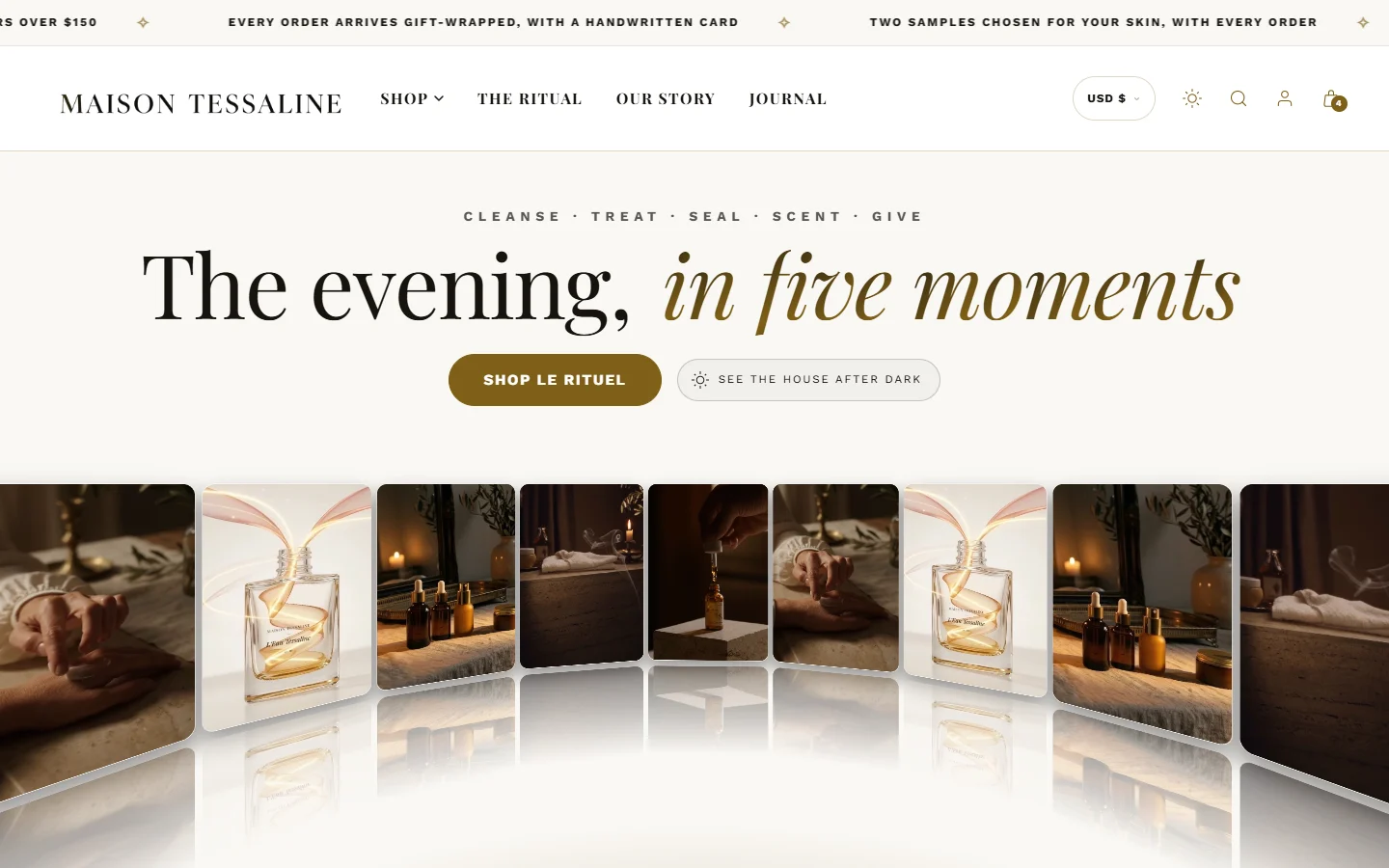
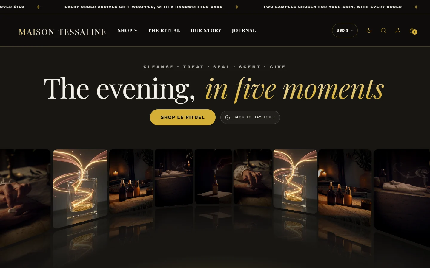
Which color does what
| Setting | Where you see it |
|---|---|
| Background | The page behind everything |
| Card / surface | Product cards, panels, the cart drawer, form fields |
| Body text | Paragraphs, labels and most text |
| Accent (gold) | Buttons, links, badges, borders, progress bars and highlights |
| Heading gradient start and end | Every heading, from one color to the other |
| Sale tag color | The "-20%" and "Save $10" tags. Leave it empty to use a tone of your accent |
Color schemes for sections
Most sections have a Color scheme setting. Each scheme is a pairing of background and text, with its own accent and lines, defined in Theme settings > Colors. Your style comes with five, from the lightest to the darkest.
Select a section and find Color scheme in its settings.
Choose a scheme. The preview changes at once.
To change a scheme everywhere it is used, edit it in Theme settings > Colors.
In dark mode every section follows your dark palette, whatever its scheme, so a page never shows a bright white band at night. A few sections that are meant to look dark in both modes, such as a dark hero, keep their own colors.
A palette for a beauty brand, in three steps
- Start from the product. The color of your caps, labels or the product itself is your accent.
- Keep the background quiet. Warm ivory for luxury and botanical brands, cool white for clinical ones.
- Use one strong color. One accent used everywhere looks more expensive than three.
How do I change the color of just one section?
Choose a different Color scheme for that section. If none of the schemes fits, edit one of them in Theme settings > Colors, or add a new scheme there.
Why are some headings two colors?
That is the heading gradient. Set Heading gradient start and Heading gradient end to the same color for single-color headings.
Was this guide helpful?
Still need help?Write to us with your shop's address and a screenshot. We reply within two business days, Monday to Friday, usually sooner.
Contact support