
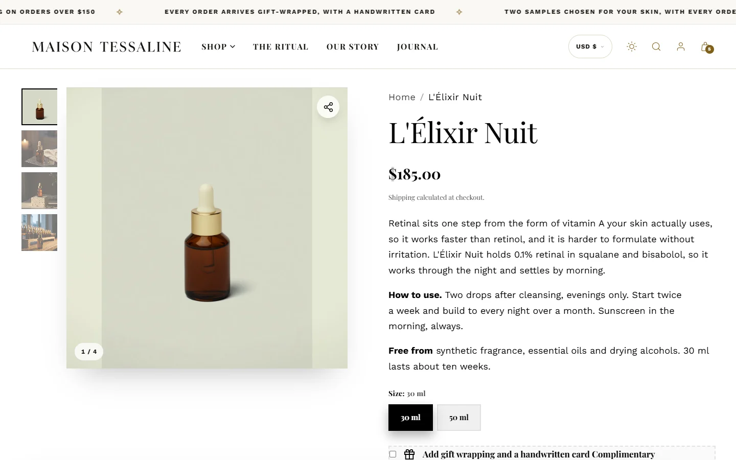
Every product uses a product template. The top of each Acanthus product template is the Product information section: the gallery on one side, the title, price, options and buy buttons on the other.
Open the product page in the editor
In the theme editor, open the page selector at the top and choose Products > Default product. Changes there apply to every product that uses the default template. For a different layout for some products, see Product and collection templates.
The gallery
| Setting | Choices |
|---|---|
| Gallery layout | Thumbnails on the left, Thumbnails below or No thumbnails |
| Image ratio | Adapt to first image, Square (1:1), Portrait (4:5) or Landscape (4:3) |
| Image fill | Contain (never crop) shows the whole bottle; Cover (fill the frame) may crop the edges |
| Zoom | Magnifier and lightbox, Lightbox only or Off |
| Keep the gallery in view while scrolling | The pictures stay on screen while the shopper reads |
The buy box blocks
Blocks in Product information can be added, hidden and dragged into any order:
| Block | What it shows |
|---|---|
| Vendor, Product title, Price and savings, Star rating | The essentials. Star rating needs a reviews app |
| Variant swatches | Shades and sizes (swatches) |
| Buy box and badges | Buy buttons, plus optional pre-order, gift box, three clinical figures, trust badges and payment icons |
| Volume discount engine | "Buy 2, save 10 %" tiers |
| Scarcity indicator | "Only 4 left", from your real stock, when stock reaches the number you set |
| Promo countdown timer | A countdown to an End date you set; it hides once the date passes |
| Clinical matrix | pH level and key actives |
| Custom text engraving | A field for a name or message, saved with the order |
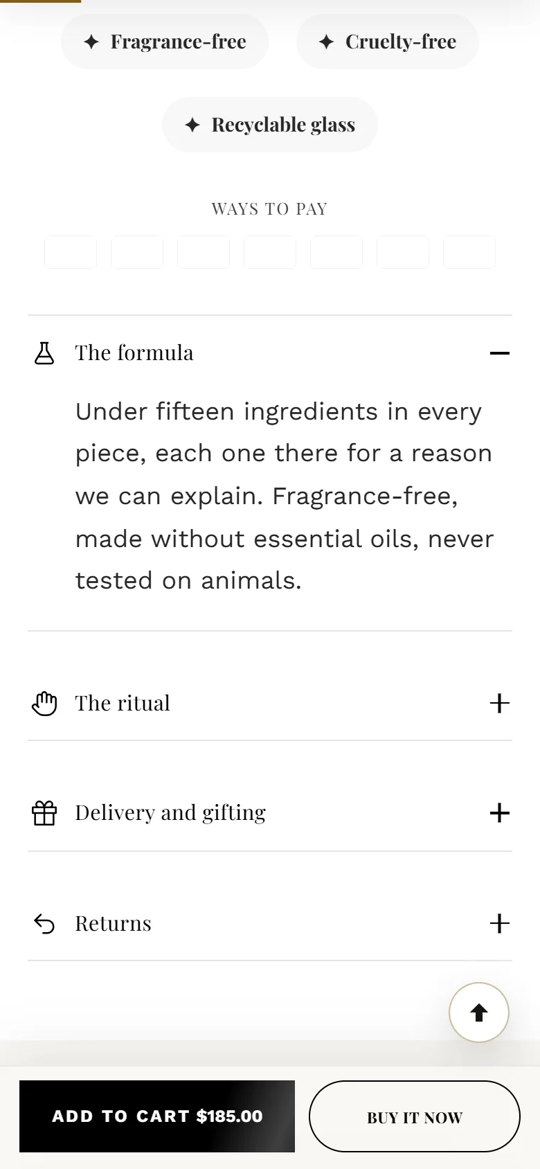
| Collapsible tab | Ingredients, how to use, shipping: text you write or a page's content |
| Description | The product's description from your admin |
Tabs for ingredients and how to use
Add a Collapsible tab for each topic. Write the text in Text, or choose a Page to show the same text on every product (a shipping and returns page, for example). Turn on Open when the page loads for the most important one.
For text that differs per product, connect the tab's Text to a product metafield: select the Connect dynamic source icon next to the setting.
The sticky buy bar
On phones, once the buy button scrolls away, a bar with the price and an add-to-cart button stays at the bottom. Set it in the Sticky buy bar section: Show it on (Phones only or Every screen) and Show the product image.
Style mode
Style mode changes the buy box's look: Default minimal, Clinical High-Tech, Social mobile first, Ultra luxury or Bold promo. Try each with your own product; it changes only this section.
Further reading on the iVishwa blog: Show what is in it: ingredient percentages that sell skincare
Was this guide helpful?
Still need help?Write to us with your shop's address and a screenshot. We reply within two business days, Monday to Friday, usually sooner.
Contact support